Intelligent Trip Classification
Designing a human-AI collaboration layer that learns from driver behavior to distinguish between business and personal trips automatically.
Motus is the industry leader in the vehicle reimbursement space, accountable for tracking over 290M miles per month and disbursing $1.4B in reimbursements annually. The Motus app helps employees log and classify their business mileage for reimbursement, a process that historically required significant manual effort.
- 01. $10M+ in annualized customer savings across the client base
- 02. 40M miles per year in personal trips eliminated through smarter anomaly detection
- 03. 71% active user engagement with new classification workflows

① Problem Statement & Goals
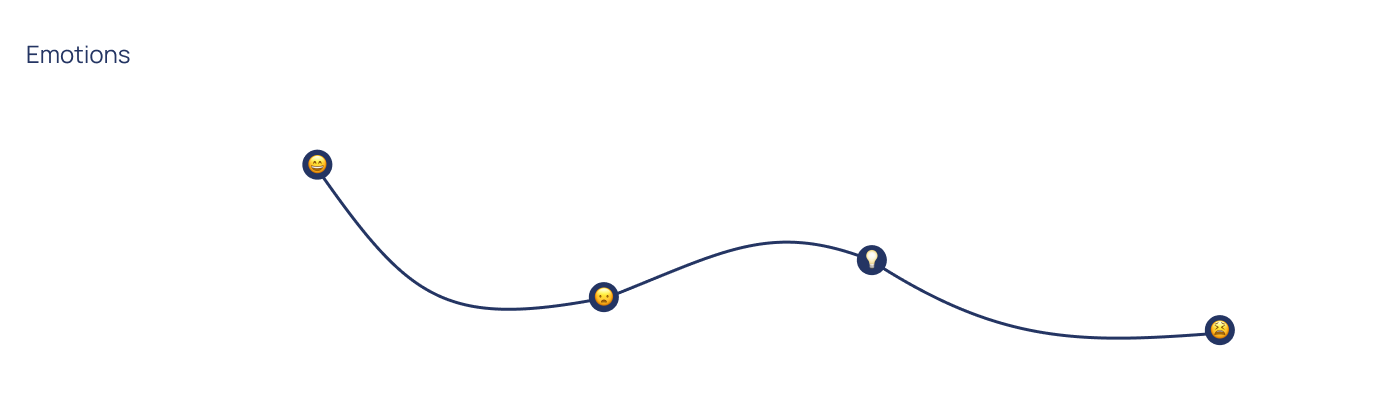
Designing for the full business day
Users don't just drive for work. They drop off their kids, run errands, and grab lunch between meetings. The Motus app tracked all trips the same way, requiring manual review of every single one before monthly submission. Without a mechanism to distinguish trip types, even the most diligent drivers were spending unnecessary time on a problem that shouldn't exist.
Our goal was to create an intelligent classification experience that leveraged machine learning to:
- 01. Recognize personal trips based on behavioral patterns
- 02. Learn continuously from user corrections to improve accuracy over time
- 03. Reduce manual review time
Before
End User
Users were dedicating unpaid time to review trip data every single month — most of which followed predictable patterns
② Research
Ten-minute reviews masking a month of friction
I conducted exploratory interviews with drivers across healthcare, construction, and other industries to understand how personal trips actually occurred during the workday and how users managed them in the app. The findings reframed the design challenge.
Key Findings
- 01. Behavior: Personal trips were frequent and unavoidable — users needed a natural way to handle them without disrupting their workflow.
- 02. Time Cost: Users spent only 5–10 minutes reviewing trips weekly, leaving little time for detailed checks.
- 03. Cognitive Load: The current trip order and editing process caused confusion and additional review time.
- These insights clarified that our design challenge wasn't just about automation. It was about creating a collaborative experience between human intent and machine prediction.
User Journey Map

③ Design Process
Three capabilities, one learning system
Following research, our team proposed a multi-phase approach that would allow machine learning to gradually assist users to address the observed pain points. By eliminating the tedious and manual experience, the app will continue to align with the Motus "set and forget" branding. To facilitate the design and execution of the 2024 roadmap, we divided the work into three distinct capabilities.
- 01 Location Manager: Enable users to classify their frequent locations, seeding the model with behavioral data.
- 02 Auto Trip Classification: Introduce automated classification based on behavioral patterns and location metadata.
- 03 Needs Review Feed: Create a feedback loop that surfaces uncertain trips for user review, closing the learning loop.
Capability 01
Location Manager
The starting point: let users manage and classify their frequent locations. Prior to this, location data could only be updated in the back-end by the ops team. Every classification a user made became training data for the algorithm.
Why it matters: By giving users control over location data, we created a virtuous cycle — every label improved the model's ability to auto-classify future trips.

- Location Search & Tagging: Search and tag locations as Business, Personal, or Home
- Predictive Locations: Surface location suggestions based on trip history
Capability 02
Auto Trip Classification
With location data feeding the model, we introduced automated classification based on behavioral patterns. This also created an opportunity to redesign the trip card itself, which research had flagged as a source of cognitive load.
Trip Card V1

- Optimized Trip Order: Surfaced most-recently-completed trips first for faster review
- Classification Toggle: Replaced manual buttons with an auto-classified state users could override
Trip Card V2

- Streamlined Auto-Classified Card: Once the model reached high confidence, the toggle was minimized to reduce clutter, but remained editable for transparency.
Capability 03
Needs Review Feed
When the model encountered uncertainty (for example, a new location or irregular trip pattern) the trip needed to be surfaced to the user for review. This wasn't just a new screen; it was a human-in-the-loop feedback mechanism essential for model accuracy and user trust.
Option 1: Add New Section to Side Nav

- Dedicated Feed: Standalone section highlighting trips requiring attention.
- Badge: indicator to clearly convey the count of trips requiring user review in the header and side nav
Option 2: Segmented Controls

- Segmented Controls: Filtered views for Needs Review, Business, and Personal.
- Needs Review Indicator: When an unclassified trip is tracked, the Needs Review tab will display an orange indicator which exists in the app for other action-required sections.
Option 3: Dashboard Landing Page

- Dashboard Landing Page: implementing a new home screen that provides a dashboard with important statuses beyond just Auto Classification, like relevant summaries or important app functionality.
- Separate Feed: Clicking on Needs Review takes the user to a separate section where they can see all trips that need classification.
- Completed Views: Once all trips are reviewed, the Needs Review section will disappear, and users will be prompted to explore all trips in either the Business or Personal feed.
④ Experimentation
Validated across industries, not just internally
To validate our design decisions, we conducted quantitative preference testing across our largest revenue clients from a wide range of industries. Participants completed classification tasks using three prototypes and ranked their experience.

⑤ Key Results
A self-improving system, not just a feature
While the UI itself remained simple, the true innovation lay in designing for intelligence: understanding how to surface automation in a way that feels intuitive, supportive, and trustworthy.
The results validated this approach: 71% of users actively engaged with the new classification workflow, 52% trusted the system enough to delete flagged trips, and customer satisfaction averaged 4.0 out of 5.0 across 11.6K survey respondents.
This project strengthened my perspective as a systems thinker and designer working with AI-driven experiences, where every design decision became an opportunity to make the model smarter. Through this work, we built more than a feature. We designed the foundation for a self-improving system that continuously evolves with its users, delivering over $10M in annual value while reducing personal trip submissions by 40M miles per year.
